
PTE Describe Image
PTE Describe Image is one of the most imperative tasks of the PTE Speaking section. It is the third in the sequence of questions in the speaking section. In the describe image task, you see an image on the screen and you need to describe the essential aspects given in there. So, in this blog, we will learn how to attempt this task to get the maximum score. Not only that, we have Describe image strategies for every test-taker with different score requirements and varying levels of English language skills. We will also see some templates for different types of describe images questions, that can help you in achieving a high score. If you like reading, please continue, but you can also watch our video below on this task, with the Complete strategy.

PTE Describe Image Key Facts
Part one of the PTE test is Speaking and Writing, and the combined time of this section is 54 to 67 minutes approximately. The describe image task assesses only your speaking skills and the scores are added only to the Speaking section. It judges your ability to view and understand the given image and provide an accurate summary of it. You get 3 to 4 describe image questions in the PTE test, if you want to know details about the number of questions and timing for each of the PTE sections, please read PTE Exam format.
PTE Describe image task, like any other speaking task, has fixed time allocation. So, let’s now try to understand the time allocation for the Describe image questions. You get 25 seconds to prepare your response, by looking at the image and thinking about how you are going to describe it. Then, you have 40 seconds to speak, in which you need to speak about the image, describe the important facts, and trends, and an accurate summary.
PTE Describe Image Layout
See below how you get this task in the actual test.
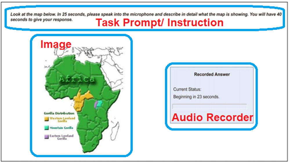
PTE Describe Image has a layout that is divided into 3 sections. At the top, you see the instruction, which is also called the task prompt, that explains to you what you need to do. On the left-hand side, you the see the image that you need to describe. And on the right-hand side, you see the audio recorder that initially shows a countdown timer starting with 25 seconds and reducing to 0 seconds, which is when the microphone is enabled and you hear a short tone, and you need to start speaking immediately. Please note that you should not start speaking before you hear the tone, otherwise your response will not be recorded. Also, be careful not to pause for more than 3 seconds, otherwise, the microphone is disabled and you cannot record anything more for that particular question.
PTE Describe Image Scoring
PTE Describe Image scoring, like every other PTE speaking task apart from Answer Short Question, is scored in three areas.
They are-
- Content – You have to speak on the given image (keywords)
- Pronunciation – Your speech can be easily understood
- Oral Fluency – You should speak without hesitation

TIPS for Describe Image task
- You need to speak for a purpose (to inform and to explain)
- Speaking at a natural rate
- Produce fluent speech
- Using correct intonation & using correct pronunciation
- Using correct stress & speaking under timed conditions.
Content
For PTE Describe Image content, you should first ask yourself this question – “Does your response accurately and thoroughly describe the image?“. You should aim to cover all important aspects and elements of the image. According to the official PTE, the best responses for Describe image questions, deal with all parts of the image, contain logical and specific information, and also include possible developments, conclusions, or implications. In other words, you should present your response in the form of an Introduction, Body, and Conclusion. Many students try to say sentences that don’t contribute anything to content scoring. Sentences like – “Overall, the image was very informative; I can see a beautiful image on the screen; The color of the graph is red and green;”, should be avoided, because you are just wasting precious time saying something which is not adding to your content score.
Pronunciation
Pronunciation is a key scoring area for all PTE Speaking tasks, including the PTE Describe image task, and the idea here is “To be easily understood by regular English Speakers. You get marks for how clearly you pronounce all the words and how correctly you stress on the syllables.”
Consonants and Consonant Clusters
There are three types of sounds in English, they are consonants, consonant clusters, and vowels. Consonants are nothing but the sounds we make, and how it sounds in Phonics for different alphabets in English (except the vowels). For example, ‘a’, ‘b’, ‘c’, etc. In total, there are 42 letter sounds in English, but we are not going to cover all of them in this article. Watch this video, if you are more interested to learn about them.
Also, consonant clusters are the ones when two or more consonants are combined together and they make a different sound when combined. For example, ‘br’, ‘ch’, ‘ne’, ‘sh’ and so on. Now, the vowels’ sounds change according to where it is used, and combining the short and long vowel sounds, there are 20 different vowel sounds in total. Read this detailed article to know more.
Word stress
Word stressing is of utmost importance in the PTE Describe Image task, as well as for the entire Speaking section. It does not mean stressing the words in a sentence, but about which syllable in a word should be stressed. If you don’t know about syllables, in simple words – a word can be divided into many syllables (and has one vowel sound).
Word Stress Example
For example, ‘water‘ can be divided into two syllables ‘wa‘ / ‘ter‘, both having 1 vowel sound ‘a’ & ‘e’ respectively. Another example, ‘Inferno‘ can be divided into 3 syllables ‘In‘ / ‘Fer‘ / ‘No‘. So, now you know what are syllables, you should now understand which syllable should be stressed within a word to sound perfect. For ‘water’, the stress should be on ‘wa‘ and not ‘ter’ (Listen here). For ‘Inferno’, the stress should be on ‘Fer‘ (Listen here).
Oral Fluency
The PTE Describe Image task advocates you to speak fluently and without any hesitations, to speak at a natural rate and with a good rhythm. This is called Oral Fluency and marks are awarded on how fluently you speak. There are 3 areas on which oral fluency is scored, they are Sentence stress, Pace and Pausing, and Voice modulation or intonation or rhythm.
Sentence stress
To describe an image properly, you should stress the meaningful words in a sentence and not the grammatical words, which is called sentence stress. Meaningful words are the ones that carry meaning in a sentence, such as nouns, verbs, adjectives, and adverbs. And grammatical words are the ones that help to build a sentence, such as prepositions, conjunctions, etc. Look at the example below.
Sentence Stress Example
The development of easy-to-use statistical software has changed the way statistics is being taught and learned.
The words highlighted are meaningful words and should be stressed. Listen here.
Pace and Pausing
For PTE Describe image task, it is quite imperative to control your pace. Many students try to speak fast to cover more points and have a sense of urgency. Never do that, since you are a non-native speaker, you should always speak at a moderate pace, not too fast and not too slow. When describing an image, you should also be cautious in pausing, as it is critical as per the PTE algorithm. Use punctuation symbols such as comma and full-stop to help you with pausing.
TIP: Not too fast & not too slow
- If you speak faster, you might not be sounding very clear.
- If you speak slow, you might not be able to cover the relevant aspects.
Let’s look and listen to the pace and pausing example below to understand more.
Pausing Example
If you are a good programmer /Short pause/, you can perform good jobs /Long Pause/. However /Short pause/, you should prepare well for your interviews /Long Pause/.
Listen here.
Voice Modulation, Intonation and Rhythm
And lastly, as part of Oral Fluency, you must also exhibit a good rhythm in your voice, which is also called as intonation or voice modulation. For PTE Describe Image task or any other speaking tasks, having ups and downs in your voice portrays that you are speaking naturally, and not like a robot in a monotonous tone. The PTE algorithm regards this as a very important aspect of oral fluency, and if you want high score, you should definitely have voice modulation in your speaking responses. Look at the example below to understand more.
Voice Modulation Example
However /Down/, with these advancements /Down/, students /Up/ sometimes find statistics /Up/ to be an arduous /Up/ task /Down/.
Listen here.
Describe Image Strategy
Now that you understand the Describe image scoring, let’s now explore the steps/ strategy that you need to take while attempting these questions. This strategy will be crucial in your PTE preparation, as it specifically outlines what the PTE algorithm expects, and how you can get the maximum score.
Step 1: Preparation
In PTE Describe Image questions, you get 25 seconds of preparation time. What you need to do in this time, is to quickly study the graph and think about the important points you can find in the image. You don’t need to cover each and every point, and also don’t go too much in detail. So, just focus on what trends or other aspects you can find and you can confidently speak on.
NOTE: You won’t have time to take down notes. 25 seconds is not enough to study the graph as well as taking down notes. You will waste important time that you need to study the image.
Step 2: Speaking
To describe an image in the PTE speaking section, you get 40 seconds. In this time, you should be able to provide an accurate summary of the image you see on the screen, including important facts and trends. Your response should also follow a structure that is strictly expected by the PTE algorithm. If your response does not have a good structure, you loose essential points. A good describe image response will have the structure as shown below (as per official PTE).
NOTE: Try to finish at around 35 seconds and never add new information to your response.
PTE Describe Image Structure
- Introduction -The bar graph/ image/ etc. represents …
- Body – 2 to 3 Key features / trends (not details)
- Conclusion – Summarize or make a prediction
PTE Describe Image Template
For PTE Describe Image task, let’s now see how many different types of images that you get in the test. It is important that you are thorough with all types of images and have a strategy and template to attempt them. NOTE: Just using the template does not guarantee you the score mentioned, it heavily depends on how clearly and confidently you provide the spoken response.
Bar Graphs Template and Tips
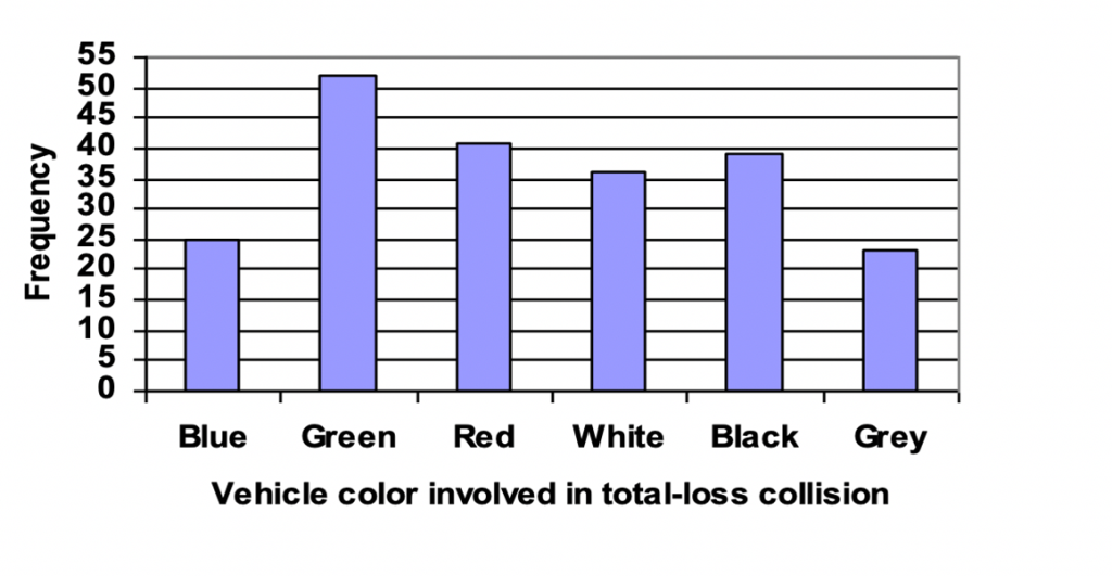
To describe a bar graph, you need to introduce the image by saying what it represents. Add the information given in the title of the graph and combine some information from X and Y axis if required. For example, in the above graph, you can say it represents “the frequency of vehicle color involved in total-loss collision“. In rare scenarios, there may not be any title given for a bar graph. In that case, you still need to introduce the bar graph, but you need to say something that can summarize the graph, by looking at the information presented in the X and Y axis (what it represents). Then, you need to talk about 2 to 3 key features or trends that you can see in the bar graph.
For example, in the above graph you can see that “Green cars are at maximum, Grey ones at minimum, White & Black are in the mid-range“. And lastly, for conclusion you need you can either summarize or make a prediction. So, you can say something like “Vehicle color has no direct relation to the total-loss collision“. Now, let’s use this information in the Describe image template that we have for bar graphs and see how beautiful your response becomes.
PTE Describe Image Bar Graph Template (80+ score)
- Introduction -The bar graph represents the TITLE + (X / Y axis information, if needed).
- Body – 2 to 3 Key features / trends (not details).
- The maximum [Keyword from TITLE] happened for …, at around …
- The …. have minimum [Keyword from TITLE], at just over …
- The …. are somewhere in the middle.
- Conclusion – Overall, MAKE A SUMMARY/ or / PREDICTION
Now, we know what points we want to speak on and what template to use, so let’s put down the sample answer for the bar graph.
Bar Graphs: Describe Image Sample Answer
Introduction –The bar graph represents the frequency of vehicle color involved in the total-loss collision.
Body – 1. The maximum total-loss collisions happened for Green vehicles, at around 50.
2. The Grey vehicles have the minimum number of collisions, at just over 20.
3. For Red, White and Black vehicles, the number of collisions is somewhere in the middle.
Conclusion – Overall, the vehicle color has no direct relation to total loss collisions
Line Graphs Template and Tips
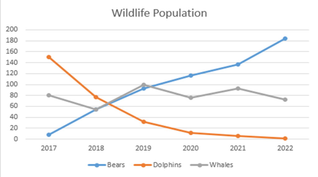
PTE Describe Image Line graphs are similar to Bar graphs, in terms of how we provide our response. Again, you need to provide an introduction to the graph. You should use the information provided in the TITLE (and X-Axis and/ or labels of graph legends). NOTE: The legend of a graph reflects the data displayed in the graph’s Y-axis, also called the graph series. For example, for the above line graph, you may say it represents “the wildlife population from 2017 to 2022“. See how the information from X-axis was added as the title of the graph was very short. Next, you need to identify 2 to 3 key trends from what you can see in the line graph.
For example, you may choose “Bear population increased significantly, Dolphin population decreased drastically and Whale population remained stable“. And lastly, for conclusion, you should make a prediction like “In future years, the dolphins may get extinct.” Now, lets use this information and populate our Describe Image line graph template to make a superb answer.
Describe Image Line Graph Template (80+ score)
- Introduction -The line graph represents the TITLE + (X / Y axis information, if needed).
- Body – 2 to 3 Key features / trends (not details).
- The [Keyword 1 from Label] increased significantly from ___ to ___ in ___ years.
- The [Keyword 2 from Label] decreased drastically from ___ to ___ in ___ years.
- The [Keyword 3 from Label] has remained moderately stable from ___ to ___ in ___ years.
- Conclusion – Overall, PROVIDE A SUMMARY/ or / PREDICTION
Now, we know what points we want to speak on and what template to use, so let’s put down the sample answer for the bar graph.
Line Graphs: Describe Image Sample Answer
Introduction –The line graph represents the wildlife population from 2017 to 2022.
Body – 1. The bear population has increased significantly from nearly 0 to 180 in the 6-year duration.
2. Whereas, the dolphin population has decreased drastically from about 160 to 0 in this time.
3. The whale population has remained moderately stable from 2017 to 2022.
Conclusion – Overall, in the future years, the dolphins might get extinct.
Pie Charts Template and Tips
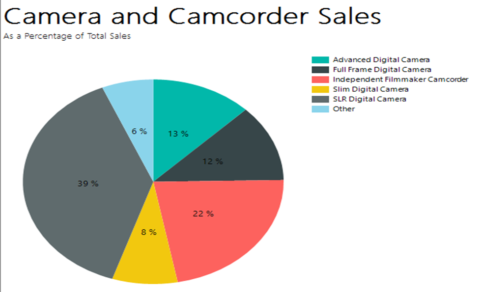
PTE Describe Image pie charts are graphs that show overall composition out of 100%, and will always have a legend with colors to highlight what colors are used for different items. To begin with, you need to provide an introduction of the pie chart. You should use the information provided in the TITLE (use the legend only if not sufficient information is provided in the title). For example, for the above pie chart, you may say it represents “the camera and camcorder sales as a percentage of total sales“. The title itself has sufficient information for introduction. Next, you need to identify 2 to 3 key features from what you can see in the pie chart.
For example, you may choose “SLR Digital is maximum with 39% sales, Independent Filmmaker Camcorder is second with 22% sales, Other camera and camcorder sales are lowest at 6%“. And lastly, for the conclusion, you should conclude like “SLR Digital camera & Independent filmmaker camcorder are the clear winners“. Now, lets use this information and populate our Describe Image pie chart template to make a great answer.
PTE Describe Image Pie Chart Template (80+ score)
- Introduction -The pie chart represents the TITLE + (use legend only if needed).
- Body – 2 to 3 Key features (with details).
- The maximum [subject of the graph – in this case sales] happened for [Keyword1 from Legend] at around __%
- The [Keyword2 from Legend] has lowest [subject of the graph], at just over __%
- The [subject of the graph – in this case sales] of [Keyword3 from Legend] and [Keyword4 from Legend] are at __ and __ % respectively.
- Conclusion – Overall, PROVIDE A SUMMARY.
Now, we know what points we want to speak on and what template to use, so let’s put down the sample answer for the pie charts.
Pie Charts: Describe Image Sample Answer
Introduction –The line graph represents camera and camcorder sales as a percentage of total sales.
Body – 1. The maximum sales are for SLR Digital cameras at 39% followed by Independent filmmaker camcorders at 22%.
2. The Slim digital camera and Other cameras have the lowest sales [Optional – 8%, 6%].
3. The sale of Advanced Digital Cam & Full frame Digital camera are at 13% & 12% respectively.
Conclusion – Overall, SLR Digital camera & Independent filmmaker camcorder are the clear winners.
Double Bar Graphs Template and Tips
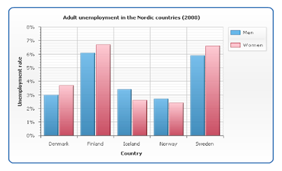
PTE Describe Image Double bar graphs are basically bar graphs with 2 or more series or categories for the same parameters, and will always have a legend with colors highlighting the categories. Again, you need to provide an introduction to the double bar graph. Use the information provided in the TITLE and Category (in the series legend). For example, the above double bar graph, you may say, represents “adult unemployment rates in 2008 for men and women in the Nordic countries“. You can see how the graph title and category legend were combined here. Next, you need to identify 2 to 3 key features from what you can see in the double bar graph.
For example, you may choose “Finland has the highest unemployment rates for both men and women, followed by Finland; Norway has the lowest unemployment rates for men and women, at around 3%; Denmark’s and Iceland’s jobless rates are somewhere in the middle“. And lastly, for the conclusion, you should conclude like “Women unemployment rates are higher in most Nordic countries”. Now, let’s use this information and populate our Describe Image double bar graph template to provide an excellent answer.
Describe Image Double Bar Graph Template (80+ score)
- Introduction -The double bar graph represents the TITLE + (categories from the legend).
- Body – 2 to 3 Key features (not details).
- The highest [subject of the graph – in this case unemployment] for [Category from legend] was/were in [___] at around __%, followed by [___].
- The [___] has the lowest [subject of the graph] for [Category from legend], at just over/ below __%
- The [subject of the graph] for [Category from legend] in [___] are somewhere in the middle.
- Conclusion – Overall, PROVIDE A SUMMARY.
Now, we know what points we want to speak on and what template to use, so let’s put down the sample answer for the double bar graphs.
Double Bar Graphs: Describe Image Sample Answer
Introduction –The double bar graph represents adult unemployment rates in 2008 for men and women in Nordic countries.
Body – 1. The highest unemployment rate for both men & women was in Finland, at around 6% followed by Sweden.
2. Norway has the lowest unemployment rates for men & women, at just below 3%.
3. Denmark’s and Iceland’s jobless rates are somewhere in the middle.
Conclusion – Overall, Women’s unemployment rates are higher in most of the Nordic countries for the year 2008.
Multiple Graphs Template and Tips

The PTE multi-graphs can be a combination of any of the two types of graphs/ images discussed here, or it could also be two graphs of the same type. PTE Describe Image doesn’t have fixed criteria for this. Your introduction should combine both the graphs. Similarly, the body should include key features/ trends from both (one by one), but you can’t cover all the aspects. So, don’t worry about including all details from both the graphs, it’s not possible to do so in 40 seconds. PTE doesn’t expect you to do that. And lastly, for the conclusion, you may choose to combine or just sum up one graph. Look at the template below for more details.
PTE Describe Image Multiple Graphs Template (80+ score)
- Introduction -The graph1 represents the TITLE of graph1, whereas the graph2 represents the TITLE of graph2.
- Body – 2 to 3 Key features (not details).
- Key feature from graph1 (look at other templates).
- Key feature from graph2
- Another Key feature from graph1 or graph2.
- Conclusion – Overall, PROVIDE A SUMMARY.
Now, we know what points we want to speak on and what template to use, so let’s put down the sample answer for the multiple graphs.
Multiple Graphs: Describe Image Sample Answer
Introduction –The Bar graph represents the reasons for travel whereas the pie chart represents the main issues for the traveling public.
Body – 1. The main reason for traveling is for work, followed by Personal & shopping reasons.
2. The primary issues for traveling include the price of travel & safety concerns, followed by aggressive drivers & highway congestion.
Conclusion – Overall, people still need to travel for work even if the prices of travel are higher.
Tables Template and Tips
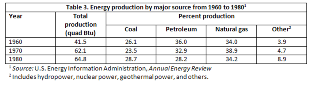
The PTE Describe Image tables are structured information provided in a tabular format. There would be a lot of information in there, and PTE doesn’t expect you to cover all of them. So, just focus on the main ones like discussed in the other graphs above.
Describe Image Tables Template (80+ score)
- Introduction -The table represents the TITLE of graph (discuss a few heading categories).
- Body – 2 to 3 Key features (not details).
- ____ increased from ____ in ___ to ___ in ___.
- ____ decreased from ____ in ___ to ___ in ___.
- ___ remained stable throughout.
- Conclusion – Overall, PROVIDE A SUMMARY.
Now, we know what points we want to speak on and what template to use, so let’s put down the sample answer for the table graphs.
Tables: Describe Image Sample Answer
Introduction –The table represents energy production by major sources such as Coal, Petroleum & Natural Gas from 1960 to 1980 in US.
Body – 1. The total production increased from 41.5 MW in 1960 to 64.8 MW in 1980.
2. Coal’s energy production decreased slightly in 1970, but increased again in 1980, whereas Petroleum’s energy production has gone down steadily.
3. Natural gas’s energy production remained stable throughout.
Conclusion – Overall, other forms of energy production such as hydro and nuclear power seems to be used increasingly more.
Describe Image Process Template and Tips
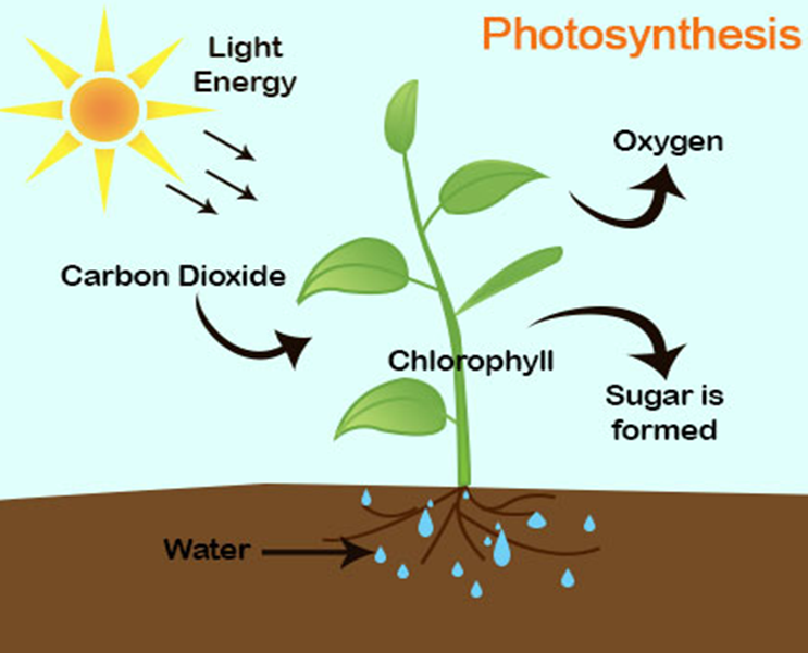
To describe an image that represents a process or flow, think as if you are explaining it to someone and just walk through step by step. Be careful not to try to explain each and everything, because some images may be very detailed. Look at the example shown below. The introduction will always start like “The image represents …“.
Process: Describe Image Sample Answer
Introduction –The Image represents the photosynthesis process that plants use to produce energy.
Body – 1. The plants primarily use carbon dioxide, water and sunlight to produce food for themselves.
2. They combine these elements with Chlorophyll to produce sugar which is used to energize them.
3. Oxygen is released as a by-product of this process.
Conclusion – Overall, the plants help to convert harmful Carbon dioxide to oxygen and provide clean air.
Venn Diagram Template and Tips
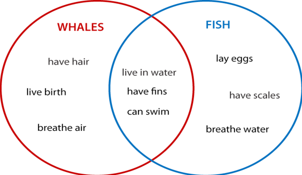
In describe image task, the Venn diagram compares two types of things/ categories. As you can see the example above, compares two categories of marine animals, showing what they have unique to themselves and what properties are common. So, follow the below template to specifically specify that you are comparing 2 things in the introduction.
Describe Image Venn Diagram Template (80+ score)
- Introduction -The image compares the characteristics of side1 and side2.
- Body – 2 to 3 Key features (not details).
- While side1 _____, side2 ____.
- side1 ____, whereas side2 ___.
- On the other hand, [compare similarities (which is common to both)]
- Conclusion – Overall, PROVIDE A SUMMARY.
Now, we know what points we want to speak on and what template to use, so let’s put down the sample answer for the Venn diagrams.
Venn Diagram: Describe Image Sample Answer
Introduction –The image compares the basic characteristics of whales and fish.
Body – 1. While the Whales breathe air, fish breathe water.
2. Whales give live birth to reproduce, whereas fish lay eggs.
3. Also, Whales have hair on their surfaces while fish have scales.
4. On the other hand, both live in water, can swim and have fins.
Conclusion – Overall, both fish & whales are aquatic animals, but they are a lot different.
Image Template and Tips

To describe an image that is just a picture about something, think of it and pick up a few points that seem relevant to you and explain them. Look at the example shown below. The introduction will always start with, “The image represents …“.
Image/ Picture: Describe Image Sample Answer
Introduction –The Image represents 2 sides of the earth’s current climatic conditions.
Body – 1. The Left side shows polluted and barren earth, whereas the Right side shows clean & green earth.
2. The Left side displays fire, air pollution & drought possibly as a result of human activities.
3. The Right side greenery, birds, trees and clean water which is ideal for all living beings.
Conclusion – Overall, if we don’t control pollution, the earth will turn unliveable/ uninhabitable and all life forms will die.
Describe Image Pyramids Template and Tips
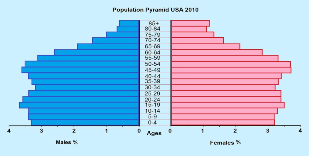
Describing a pyramid image is similar to describing bar graphs or line charts or even tables. We will use the same structure as we did with the other PTE Describe Image types, see the sample answer below.
Pyramids: Describe Image Sample Answer
Introduction –The image represents the population pyramid for men & women in 2010 for various age groups.
Body – 1. The maximum female percentage is for the age group 45 to 54 at nearly 4%, followed by 15 to 29 age group at nearly 3.5%.
2. The maximum male percentage is for the age group 15 to 19 at nearly 4%, followed by 20 to 24 age group at nearly 3.5%.
3. The lower age group population percentage is similar for both men & women.
Conclusion – Overall, females have a higher population percentage in the old age groups.
Describe Image Maps Template and Tips
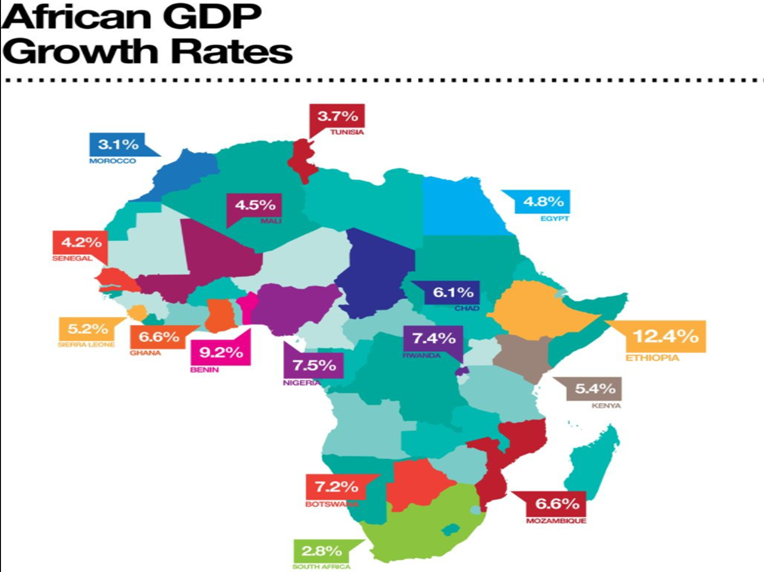
The last image type of PTE Describe Image is maps. Think of it as a picture with numbers (stats). It will always be a map of a country, region, continent, or world and it will show the distribution of anything across the map. So, the introduction is quite similar to what we do for other describe image graphs, “The image represents TITLE“. Again, 2 to 3 key features in the body and lastly a conclusion. Have a look at the sample answer below and you will understand.
Maps: Describe Image Sample Answer
Introduction –The Image represents African GDP Growth rates from 2010 to 2012.
Body – 1. The highest GDP growth rate is for Ethiopia at 12.4%, followed by Benin at 9.2%.
2. Nigeria, Rwanda and Botswana have GDP growth rates between 7 and 7.5%.
3. South Africa has the lowest GDP growth rate at 2.8%.
Conclusion – Overall, the nations in central Africa have the maximum average GDP growth.
PTE Describe Image Template (People with Average English skills)
Before, we discussed the templates and structures that can surely fetch you the top score in Describe Image task, but it also requires a certain degree of expertise in English, so that you can speak using the structure in the PTE test. If you feel your English is not that strong, don’t get disheartened, as we also have a template for such students. NOTE: Just using the template does not guarantee you the score mentioned, it truly depends on how clearly and confidently you provide the spoken response.
PTE Describe Image Template (People with Average English skills)
- Introduction -The given image represents several trends and features for [TITLE OF THE GRAPH]. A deep analysis of the picture reveals a lot of detail.
- Body – 2 to 3 Key features
- The image displays various things such as [word1], [word2], and [word3].
- Similarly, [word4], [word5], and [word6] can be observed in the image.
- However, the illustration also highlights [word7], [word8], and [word9].
- Conclusion – In conclusion, the image provides useful information.
Let’s look at an example of how to use this template. Refer to the MAP image shown above, we will use the same image to provide you with a sample answer.
Describe Image Sample Answer (People with Average English skills)
Introduction –The given mage represents African GDP Growth rates from 2010 to 2012. A deep analysis of the picture reveals a lot of detail.
Body – 1. The image displays various countries such as Ethiopia, Benin, and 12.4%.
2. Similarly, Rwanda, Botswana, and 7% can be observed in the image.
3. However, the illustration also highlights South Africa, Nigeria and 2.8%.
Conclusion – In conclusion, the image provides useful information.
PTE Describe Image Practice Questions
We can guarantee that this article is the most comprehensive study material available on the internet for the PTE Describe image task. To move ahead, you need to do a lot of practice and also get some degree of feedback from PTE Experts. So, join Edutrainex today and our PTE specialists will help you to practice the questions and also identify what areas you to improve. With the in-depth feedback that Edutrainex provides, you can clearly see the areas in which PTE marks and you can focus on them to excel. Our feedback and insights are helping a lot of students to improve their speaking skills and master the PTE Describe image task. To identify problems in your speaking and what areas you need to improve as a non-native speaker, read this article.
Top .. top top … post! Keep the good work on !
Thank you so much for sharing this wonderful post with us.